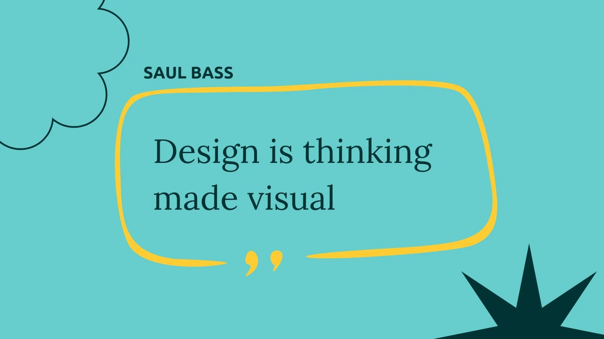
How to Balance with Intention (in a 30min design challenge)
A quick challenge with lasting impact
Not every design project involves hours of brainstorming, planning and execution. Sometimes, all it takes is 30 minutes.
I was recently involved in the organising team of the Décor and Design Show. I happened to be a the right place at the right time to lend my design skills when an exhibitor had to leave early. Rather than leave a blank wall, I was tasked with designing some posters that would promote the exhibitor’s products.
It seemed like an interesting challenge. But what I didn’t expect was how much it would teach me about one of the most important (and often invisible) parts of my design practice: balance and harmony.
The process
Apart from including the exhibitor’s Instagram handle and stall number, I had no set brief.
I had a blank canvas.
The clock was ticking.
With no time to second-guess, I started to create.
I had limited time to sketch and test multiple ideas. Instead, I started with my emotions from the exhibitor’s wall art.
Her work reminded me of fluidity, movement and abstract shapes. I wanted to create a poster that would accentuate these ideas and complement her art pieces.
Designing on the clock
With no time to overthink, every decision came from my gut instinct. More than aesthetic instinct, I had to focus on what I wanted the poster to evoke. I began to ask myself questions like:
What does the poster need to say? And how do I help it say that, visually?
How would I feel walking past this poster?
Is this connecting with the audience?
I started by creating an abstract gradient fluid background. The colours were selected from the art piece itself - which was an added touch for cohesion. I used simple typography that the exhibitor herself uses for consistency.
But halfway through, something didn’t feel right. The background I had designed was fighting for attention with the artwork. It drew attention away from the main focal point. I had to reassess.
I focused on the important elements:
Tweaked the colours so that they were complementary but did not blend with the artwork
Added a shadow element to the gradient blobs and artwork backdrop to allow for a more visceral three-dimensionality to the poster
Added a subtle texture to the background so that the artwork pieces would stand out better
Suddenly, the design started to feel a lot better.
These subtle but important shifts allowed balance and harmony to thrive.
Balance is about intention
These tweaks were minor. But they can make the biggest difference.
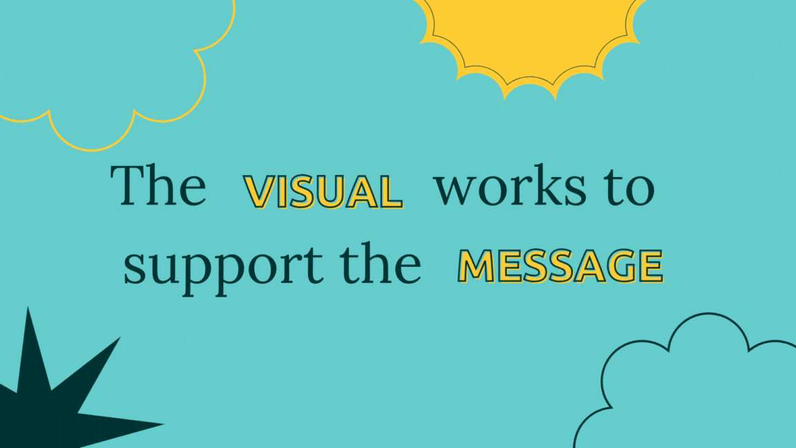
This quick design exercise reminded me that balance isn’t about having symmetrical elements on a page or sticking to a grid. It’s about how the elements relate to each other and how the piece speaks as a whole.
In design, balance happens when nothing is shouting over something else. It’s when form and function coexist together. It’s when the message feels effortless to read, even if it took serious effort to create.
It’s also deeply emotional. When something is in harmony, we feel it before we even know why.
How this reflects my design thinking
While this 30-minute challenge was an unexpected challenge, this process mirrors exactly how I work with real clients.
Behind every logo, every colour choice, every typeface is a strategic decision rooted in intention. I carefully consider everything: business goals, the brand’s voice, its values, and most importantly, its audience.
Then, I translate that strategy into visual language. Not just to make things look good, but to help people feel connected and drive impact.
A few principles I always carry into my design process:
Form and emotion should coexist harmoniously. Design should stir something.
Clarity is number one. The audience should always know what the core message is.
Balance isn’t static. It shifts with context, brand tone, and platform.
Why this matters for you
If you're reading this as a business owner, marketer, or founder — you probably want more than just “a good designer.” You want someone who can take your story and make it resonate.
That requires balance:
Between your message and your visuals.
Between boldness and trustworthiness.
Between standing out and fitting in - and just enough to build belonging.
My role is to help you bridge that gap with thoughtful design that captures attention and creates meaningful connection.
Final Thoughts
It’s easy to think of design as just “making things pretty.” But good design is felt, not just seen. And creating that balance takes experience, clarity, and intention.
Even in 30 minutes, design can speak volumes. Imagine what we can do with a full project.
Ready to create something beautiful and intentional together?
Check out my portfolio or book a discovery call to chat more about your brand.